Author Archives: Nancy Haberman

Cleveland Airport Layover

Dr. Gino

“Oh my, is he serious?”

As we approached our gate, I couldn’t help but be struck dumb by the goofy looking dentist in the billboard posted directly across from Gate 20C. Enough to stop me in my tracks, I read the headline, and grabbed my husband, Bob, by his shirtsleeve. “Is it just me?” I asked Bob. He saw the sign, and we looked at each other. After having a good chuckle, we took seats waiting at the gate, where I attempted to test my new camera equipment.

In all likelihood, as a graphic designer and teacher of design, I am not your typical observer, but I was a captive audience during a five-hour layover. Let’s just say I had a lot of time on my hands. The poor airport gate agents had to stare at Dr. Gino’s new ‘doo day after day.

“Uh, he’s not working on my teeth.”

One of the agents walked over to a small group of us who were being entertained by the reactions of the rushing travelers. “Do you think we should call him?” the agent asked the group. Several passengers gathered around the sign, and the three agents pondered over the dilemma. Should they, or shouldn’t they call Dr. Gino and warn him about the ruckus his sign is causing?

“Yes, but perhaps that was his intention? It could be a genius marketing plan,” a female agent suggested. “Look at all the people who are drawn to the ad and are talking about it.”

Passersby were surely gawking and talking about Dr. Gino. Maybe they’re still talking today.

“Honey, you’re not going to believe this.”

Airline passengers pass the time people-watching at a busy airport terminal where a billboard greeted arriving and departing travelers.

Discoveries

There’s nothing like a trip out of the country, and then getting snapped back into reality to help one see the forest once again. More reflections later. Here’s hoping the trees won’t be in the way.

boy with ice cream cone

One of these days, I’ve got to learn my Manual settings! But that means I have to be able to Focus. And that means I have to be able to See! What will I do?

Featured Artist Showcases Coffee Table Book

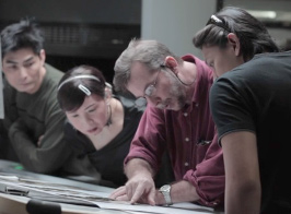
David Hartung performs a press check on his book, Macau: Work in Progress.

Featured Artist, David Hartung, performs a press check on his book, Macau: Work in Progress. A video is available for viewing at PearlRiverGallery.com.

Watch the printing, binding and packaging of Macau: Work in Progress, as photographer, David Hartung, narrates this seven-minute video on the making of his documentary coffee table volume. You can also see a novel animated preview of the entire edition at PearlRiverGallery.com.

Pearl River Gallery was founded by photographers David Hartung and Forbes Conrad as a vehicle for distributing quality photographic materials in a way that makes sense for content creators and buyers alike.

The gallery is the official venue for US distribution of David Hartung‘s book Macau: Work in Progress. Books ship from their California warehouse.

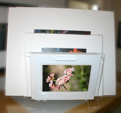
Print bins display prints in a variety of sizes

clear acrylic

Clear acrylic print bin lets browsers focus on prints, not container. The smaller prints shown here are 8x10", doubled matted with foam core back, the medium prints are 11x14", and the large are 16x20".

This clear acrylic print bin is a handy solution for storing, carrying and displaying matted prints. Molded from a single sheet of eighth-inch acrylic with two handles, the 12-inch wide display stands 9.25 inches high on a counter top or table.

The angled arms of this elegant display make it easy for visitors to flip through a dozen or more images without disrupting the viewing area.

The print bin is a no-brainer solution for artists and photographers who want to make a variety of images available for viewing in limited space. When off duty, this multi-purpose container can moonlight in the bathroom or den as a magazine or newspaper rack.


New Pastel Stretch Loops Complete Spring Note Card Sets

stretch-loop-yellow

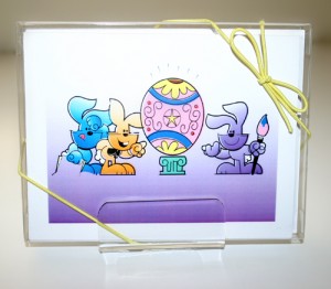
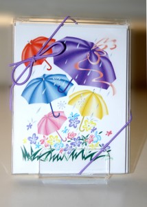
Matte Yellow Elastic Stretch Loop shown around a clear plastic A2-1/2BOX. The single box of 8 cards and envelopes is displayed on a Clear Acrylic Small Card/Print Stand, CASPS.

Springtime is just around the corner, and Oak Creek Printworks wants to help you with your holiday packaging by introducing the 10-inch elastic stretch loop in two new spring colors. We’ve added a matte yellow and a matte lavender to the choices for dressing the A2 size note card box.

stretch-loop-lavenderLast year, we wanted to encourage our customers to try the metallic blue, purple, and copper, and the matte pink, baby blue, black and white stretch loops, so we gave away one free stretch loop, priced at $.21, with each A2-1/2BOX.

When customers realized there was no cost for the loop if they purchased a box, they began to broaden their choices beyond the typical gold and silver, by far the more popular selling colors.

So this year, when the latest colors, matte lavender and matte yellow, arrived in time for Easter and other spring holidays, we decided to extend the offer of one free stretch loop with any A2 size box, ranging in depth from 1/4-inch up to 2-inches. Just make a separate item purchase for each color stretch loop desired. For example, if you want 100 A2 boxes with four different color loops, place an order for four individual items, 25 boxes for each color desired.

To order these ten-inch stretch loops without the A2 box, (though we don’t know why you’d want to) we’ve provided links below to each of the product pages.

stretch-loops-13-colors

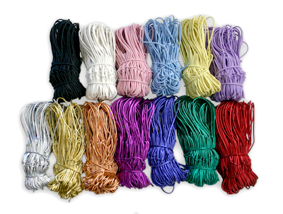
Matte colors line the top row of 10-inch stretch loops, while metallic colors are shown in the bottom row. Matte yellow and mat lavender are the newest colors in the 10-inch line of elastic stretch loops.

Choose from a wide selection of colors

Matte:

Metallic:

  • Gold
  • Silver
  • Copper
  • Green
  • Red
  • Blue
  • Purple

The single box of 8 cards and envelopes shown in the above images is displayed on a Clear Acrylic Small Card/Print Stand, CASPS.

Featured Artist – David Hartung, Winter/Spring 2012

Photos and Text © by David Hartung
www.davidhartung.com

Six-month backpacking trip becomes life-long journey

David Hartung

David Hartung

For nearly 20 years I’ve been living and working in Asia. During this time my constant companion and magic ticket to enter into the lives of so many people has been my camera.

I was first introduced to Asia in 1985 when I set out to do what was planned to be a six-month backpacking trip. Those six months then got stretched out to what became four years. The trip took me to Japan, Hong Kong, China, Taiwan and South Korea. It was in South Korea where I decided to live for the next three and a half years.

The 80s were a turbulent time for South Korea in which the country was experiencing dramatic changes in their social and political system. At that time the country was governed by a military dictatorship, which, like most dictatorships, didn’t much appreciate dissent. However in the late ’80s activists and students took to the streets and held massive protests on an almost daily basis demanding an end to military rule and for the political system to be opened up to everyone.

Fearing the protests could disrupt the 1988 Summer Olympics or even cause the Olympics to be moved to a new host city, the military lead government gave in and opened up the 1987 presidential election to everyone.
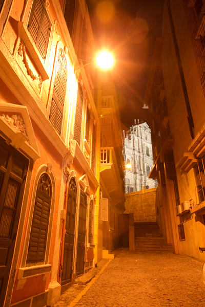
Ruins of St. Paul’s

‘Ruins of St. Paul’s,’ a popular symbol of “old” Macau

Modern day Macau

Modern day Macau


It was an extremely interesting and exciting time in South Korea. I could see the country changing right before my eyes and I did all I could to document visually these events. My days were spent photographing riots, election activities, candidates and later the Olympic games.

While in Korea, I met and married, and, and at the end of 1988 my wife and I returned to Southern California where I got a job with the Ventura County Star Free Press, and then later moved over to the Thousand Oaks News Chronicle. Working on daily paper was a great experience and taught me how to work and think quickly while on deadline.
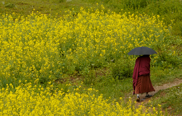
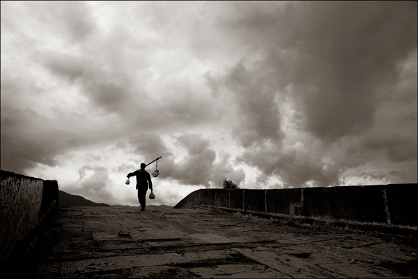
Tibetan Buddhist monk

A Tibetan Buddhist monk walks through one of the fields surrounding the Songzanlin Monastery near the city of Shangrila, China. The three hundred year old monastery was built by the fifth Dalia Lama and houses several hundred monks.

However, after about five years I felt a strong desire to return to Asia. An opportunity presented itself when my wife, now working as a flight attendant for United Airlines, was offered a position at a new base they were opening in Taiwan.  With little hesitation we packed our bags and set out to begin a new life in a new country.

Taiwan, as it turned out, was not a popular place for foreign journalists or photographers to be based. This fact actually ended up working in my favor. Prior to going to Taiwan I made a trip to New York City to meet with photo editors to show them my portfolio.

With no introduction I would cold call these photo editors who worked for the biggest names in the business. The initial response to my introduction garnered no interest until I mentioned that I was based in Taipei, Taiwan. As soon as I mentioned this fact I was asked how long I was in town and when I could stop by the office for a chat.

It seems that finding competent photographers they could trust to carry out their assignments were difficult to find in Taiwan. Typically they would have to fly someone in from Hong Kong or elsewhere to do this work. With budgets shrinking they were relying on locally based photographers to do the work whenever possible.

That said, it was still difficult to get assignments from these editors. Being an unknown photographer made it risky for them to trust me with a big assignment. However after doing a few jobs for some international magazines my name was starting to get seen.

Yunnan Naxi Musician

Performance of ancient Naxi ethnic music at a theater in LiJiang, China. Many of the orchestra’s members are over 80 years old. They perform daily for visitors keeping this ancient form of music alive.

Bai Sha Village Elder

Portrait of a village elder in the courtyard of his home in a village called Bai Sha located near the city of Lijiang in China’s Yunnan Province.

My big break came when Newsweek asked me to shoot a cover and exclusive interview with the newly elected President of Taiwan named Lee Teng-hui.  This was the first, of what was has now become many, extremely stressful shoots in which I had only a few minutes to make a photo. His handlers told me that I would have three minutes to do the cover shoot.  I, of course, responded with confidence that it would be no problem.  While my outward appearance was that of a calm, confident photographer my inner self was battling a huge case of anxiety.


The plan was to first shoot the interview and then at the end shoot the portrait. I was nervous to say the least, and then to add to my stress level, my camera died as soon as President Lee walked into the room. Fortunately I had a second body with me and the rest of the shoot went smoothly. The portrait ended up on the cover with a huge headline saying, “Mr. Democracy”. This issue received a lot of attention around the region, which in turn, helped me to get more jobs.
We ended up living in Taiwan for nearly 10 years, and during that time I photographed a variety of topics. Tension between Taiwan and China meant there was constant flow of stories covering this topic. Taiwan was also a big industrial base for many high-tech companies so I was doing quite a lot of business and industrial photography as well. Additionally, I kept busy shooting feature and travel stories all over Asia for a variety of publications around the world.

In 2005 I decided to relocate my base to Shanghai, China. Much of the work that had been keeping me busy in Taiwan was eroding away with all the attention going to China. So, like any other migrant worker, I followed the work. Fortunately many of the clients that I established in Taiwan continued to hire me for their mainland assignments.  I kept busy doing much of the same sort of work I had been doing in Taiwan. Shanghai is a major business center in China so much of my work was for international business magazines such as Forbes and Businessweek.
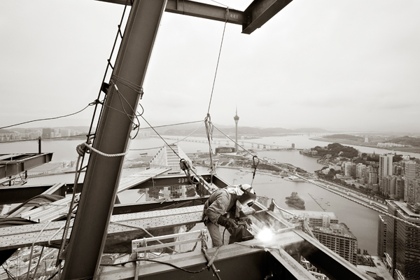
Macau Steel Worker

The city of Macau, gaming capital of Asia, sprawls below a steel worker raising a new skyscraper.


While in Shanghai I was contacted by a friend who was starting his own magazine and he asked me to help him get it going.  The idea for the magazine was to cover an area of the Guangdong Province called the Pearl River Delta which is located on the southeastern side of China.

We did five issues of the magazine which was called Destination PRD. During this time we came to Macau, which is also in the Pearl River Delta, and quickly realized that the small city was growing and changing at a phenomenal rate.
We then decided to create a publication focused solely on Macau and called this publication Destination Macau. The new publication achieved some early success and proved to be a more viable publication than Destination PRD. We poured all our attention into Destination Macau until it drew the interest of a venture capital company that decided to buy into the publication. With this injection of cash I was asked to move to Macau and work fulltime for the publication.

APPT Tournament

Poker Stars’ APPT Tournament held at the Grand Lisboa, one of the many casinos in Macau.

Working for one publication was a lot of fun. In many ways it was a dream job. We covered a whole array of topics which included entertainment, dining, fashion, culture, cultural events and business. We had nice clean design where the photos were used big and I had a lot of freedom to do what I liked.

During this period of time Macau was growing quickly with the arrival of new mass-market gaming resorts. Several Las Vegas casinos, such as the MGM, Las Vegas Sands Corp., and Wynn, as well as other foreign and local operators, received licenses to open casinos in Macau, so they were all busy building their properties. All of these new resorts are large and impressive. Macau was becoming the adult playground for the Chinese.

There was so much happening and I was shooting so many images documenting this activity that I soon began thinking that a book could be created from this material. With that idea in my head I began to organize my work and even do some sample layouts. And then when I thought I had enough material I laid out an entire book and sent it off to Blurb, a publishing company that will print a single book. With this, I was able to begin showing the book around to gauge interest.
Fortunately the company that owns Destination Macau liked the project and agreed to print the book.  The book, called Macau-Work in Progress,  was released on Dec. 6, 2011 and is currently available in bookshops around Macau and Hong Kong, as well as on Amazon in the US.
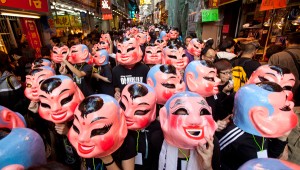
Fringe Festival

The Macau government welcomes the art community by hosting the Fringe Festival. Here participants parade from the St. Paul’s Ruins to Senado Square.

I’m still based in Macau and have no immediate plans to relocate any time soon. My work with Destination Macau is not as involved as before, as I’m now pursuing other projects and freelance work. One of those projects is documenting life along what is known as the Ancient Tea Horse Trail located in China’s Yunnan Province. This trail was once an important trading route between Tibet and Southwestern China and on to neighboring countries such as Laos and Burma.
In addition to my photography work I’ve also been teaching photojournalism classes on a part-time basis to students at the United International College located in Zhuhai, China.
Life in Asia continues to be interesting to me, so as long as I can hold a camera I hope to keep working in this part of the world.
Macau, Work in Progress

Macau, Work in Progress


David Hartung recently published his first book of photographs, Macau: Work in Progress, with story by Anita Duffin, and commentary by José Luís De Sales Marques. Macau: Work in Progress is available through PearlRiverGallery.com.

While David captured Macau’s transformation with his lens and very talented eye, Anita documented the city’s rise in travel, gaming, lifestyle publications, and newspapers, reporting locally and internationally as a freelance journalist for more than seven years.

Annual Christmas Card Challenge

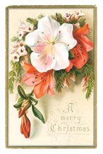
Victorian era Christmas cardEvery year when it comes time to make the holiday card, whether for business or personal, I struggle to come up with fresh ideas that top previous years’ efforts. Invariably it’s the shoemaker’s kid who goes without shoes…that was me growing up as the shoemaker’s kid, and it’s still me as a designer, generating fresh ideas for clients year after year. No matter how much design and printing styles have morphed over the 17 decades since Christmas cards were first exchanged in London in 1843, much about the sentiments and adornments remain virtually unchanged.

Christmas cards came to Americans in 1874 thanks to Louis Prang, a Boston printer, illustrator, “father of American greeting cards” and namesake of the Louie Awards. Prang first offered Christmas cards as a commercial product in England in 1873. His exquisite chromolithography full color illustrations and printing set the industry standard for mass produced color prints displaying small animals, butterflies and flora among the popular subjects. By the next decade Prang produced designs for greeting cards representing all the major holidays.

Victorian era Christmas cardMany of the holiday cards from the Victorian era were derived from nature. In addition to a folding greeting card, postcards and bookmarks were popular holiday greeting sizes.

This year’s inspiration for my greetings comes, not just in the form a greeting card, but in a practical keepsake that is multi-functional. My obsession with bookmarks stems from the fact that I haven’t give up on the printed word yet. I got the Kindle as a gift, and it was a handy gadget to carry around while traveling, provided it had no technical issues. There were issues, and I spent needless vacation hours resolving them, finally exchanging my Kindle for a new one. Since then, we’ve opted for an iPad, but I don’t use either the Kindle or the iPad as a replacement for books or magazine. No thank you, I’ll keep my print editions. Magazines just aren’t the same on a Kindle.

Nearly every print edition of a book requires a bookmark as a placeholder, and I may be reading or perusing a dozen books at once. Since I know there are many others like myself who find their electronic gadgets otherwise indispensable, but aren’t crazy about curling up with their iPad, I figure everyone needs a bookmark. So instead of gift tags, which are typically too small for the names that need to fit onto it, I’m using bookmarks, and I’ll be sending them or something akin to them this year.

Oak Creek Printworks can print bookmarks to double-duty as cards or gift tags. Click here to link to Custom Printing. We print in the following formats. Measurements indicate trim size: Gift cards – 3.25 x 2.25 inches, A2 note cards – 4.25 x 5.5 inches, A6 greeting cards – 4.625 x 6.25 inches, A7 greeting cards – 5 x 7 inches.

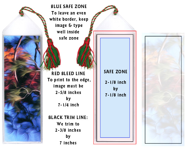
specs for printing bookmarks


Pantone Guide to Communicating with Color

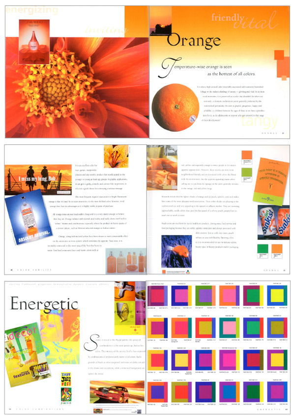
Three spreads from Communicating with ColorJust a few years ago, Leatrice Eiseman’s classic Pantone Guide to Communicating with Color, published in 2000, was out of print. In 2006 Eiseman came out with a second book continuing her color explorations, Color: Messages and Meanings. By that time, used copies of the first color book were going for nearly $200, way too steep for all but the collector.

I recently saw Eiseman’s 2000 book pop up again on Print and How magazines’ mydesignshop.com website in their “Deal of the Century” category. While it’s a bit too soon to make a hundred-year claim, I have to admit, Print and How magazines are offering those interested in the study of color a truly smoking deal.

Treat yourself and your designer buddies to a priceless holiday gift that you can be sure will be a handy resource for years to come. I’m delighted that I’m able to replace my tattered copy held together by rubber bands with a brand spanking new book for just $4.99. That’s really has got to be the “deal of the century!”

Consider Envelopes and Packaging Before Determining Card Size

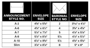
We understand that when inspiration strikes, you want to start work immediately on creating your greeting cards. However, it is important to consider the size and style of the envelope and packaging before choosing the size for your card. Once the envelope size and style are chosen, create  the greeting card slightly smaller so that it will slide easily into your envelope.

It’s best to begin with the envelope style and size. Envelope styles are generally defined by their use; for example, commercial, booklet, ticket envelopes and so on. For artists and crafters creating greeting cards, one of two envelope styles are typically used—baronial and announcement envelopes, which differ in their size and the shape of the envelope flaps.

baronial style envelope

Baronial Style Envelope

Baronial envelopes are considered the most formal of envelope styles and have a deep, pointed flap. While they can be used for greeting cards, they are most widely used for formal invitations and announcements.

announcement style envelope

Announcement Style Envelope

Announcement envelopes are made to be used with a much wider range of text weight and cover papers than baronials and are distinguished by their shorter, squared flap, which can be plain or deckle-edged.

At Oak Creek Printworks, we carry mainly the announcement style envelopes because they are available in a wide range of paper colors and weights; whereas, with baronials, there is typically less choice.

Recently we were able to create a unique blank note card set with with matching baronial envelopes and we wanted to let you know about this new product.  We have created a limited quantity of matching cards and envelopes in bright yellow, hot pink, purple, lime green, and bright orange. A6 size bright note cards and matching baronial envelopes are an Oak Creek Printworks original!

envelope size chart

A6-bright-set

A6 size note cards with baronial style envelope