Category Archives: Artists

Momentary Contact – A Call to the Heart

by Adonna Ebrahimi

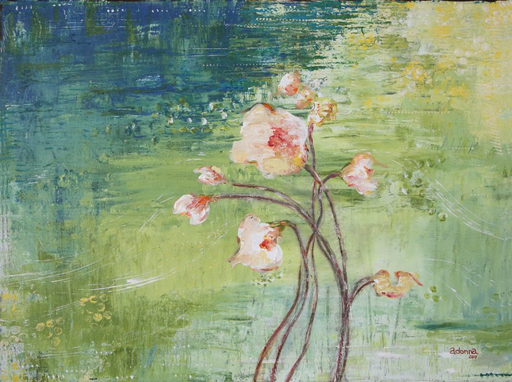
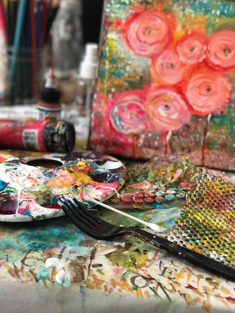
For this body of work, instead of holding a paintbrush, I challenged myself to use natural objects from the outdoors and discarded items from the home. The contrast of these dual sources brings competing energy to the process. I like the pleasant tension. Pressing my fingers into the deep smooth paint and onto the flat coarse canvas sparks a sensation of pure joy and energy and reveals these flowers as I enthusiastically create. I hope you can appreciate this experience and perhaps imagine how you might approach it if given the time and space.

I have always loved flowers, everything about flowers. When I plant them, I wear no gloves. I want to feel the soil as I prepare the space that will ultimately nurture beautiful blooms. I want the touch and the scent of the soil on my hands. It connects me with the focus of my art. Have you ever felt that? If not with soil and flora, then perhaps with some other tactile creation. You of course have.
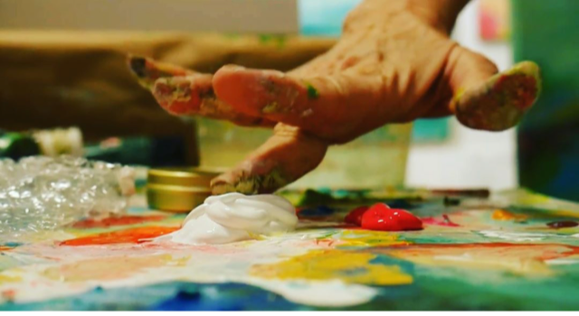
Flowers have a general, basic design that repeats in thousands of forms. And yet, each one is its own miracle of intricate shape, texture and fragrance. A single flower can compel us to joy. And when one flower combines with some others – of the same species or not – in a single spot, the result can mesmerize an unsuspecting viewer. I seek that power when I paint.

Some of my “tools”. Fork, feather, bubble wrap, credit card, shelf liner, and my fingers, of course 🙂

Bio

Adonna Ebrahimi
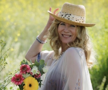
Born and raised in the Cincinnati Tri-state area, Adonna relocated to the West Coast in 1998 and began her professional art career. After being introduced to commercial art through a vocational – technical program in high school, she knew at a young age art was her calling. While working for small advertising agencies in Northern Kentucky and New Jersey she raised a family while eventually being led back to what she has always held dear in her heart, creating original art. Adonna’s mission is to create art that inspires and uplifts people in their sacred space.

Working out of her studio at H Gallery & Studios off Main Street in mid-town, Ventura, CA, Adonna invites collectors inside by appointment. She shares new work on social media platforms, Instagram and Facebook, and you can find her @ArtistrybyAdonna as well as on her website, www.artistrybyadonna.com.

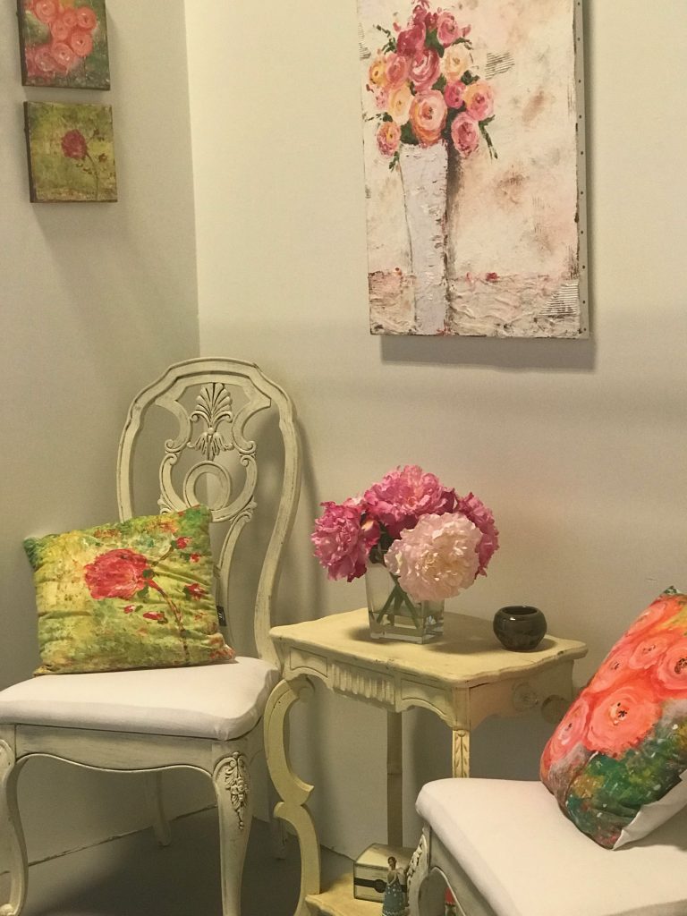
Her floral interpretations invite you to experience her love of flowers and transmits onto canvas unique tools found in nature and one’s household versus standard brushes. This has resulted in a body of work that prompts viewers to take a much closer look.

Guide to Card Sizes

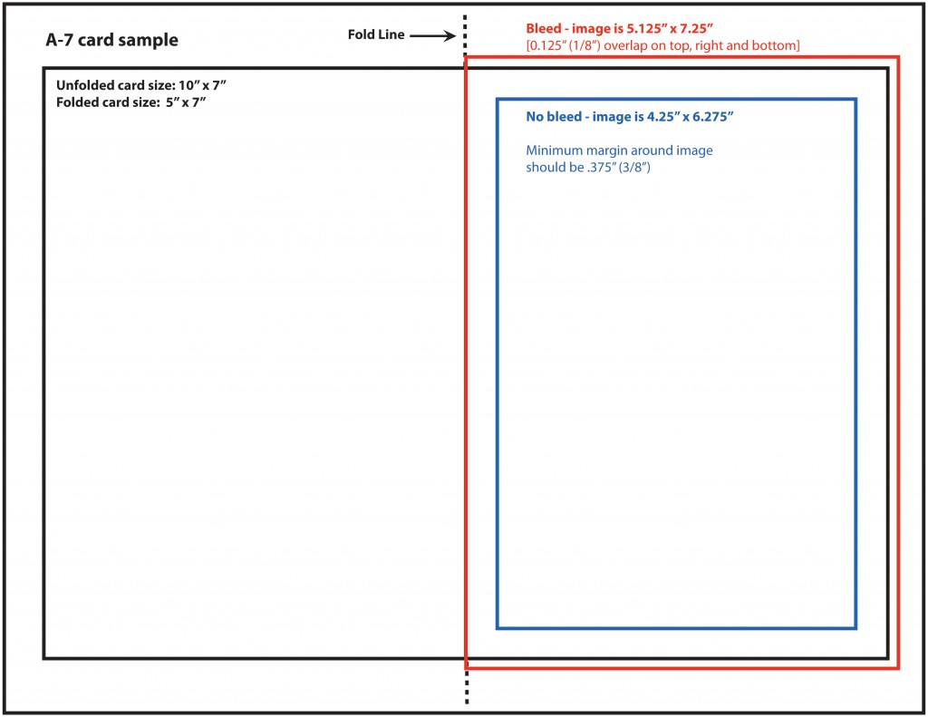
Preparing handmade greeting cards or note cards can be tricky, especially if you want them to fit in standard sized envelopes. Here is a chart that will help you as you prepare your card stock and artwork. Protective sleeves are also a nice packaging touch, and can be purchased to fit only one card and envelope, or up to 8 cards and envelopes. Note that the A6-8 sleeve only holds about four A6 greeting cards and envelopes.

Use the charts below indicated standard U.S. sizes to assist in sizing when creating your own greeting cards.

The sample below shows how to position your artwork on 8 1/2″ x 11″ cardstock. If you are using electronic files, and you want the image to print right to the edge of the card (called a “bleed”), the image needs to be larger than the size of the card. The red lines below indicate the bleed position on an A7 vertical card. The bleed must hang over on three sides by a minimum of .125″.  Then, after you print your card you can trim it to the right size.

Flair Magazine Annual is Back in Print

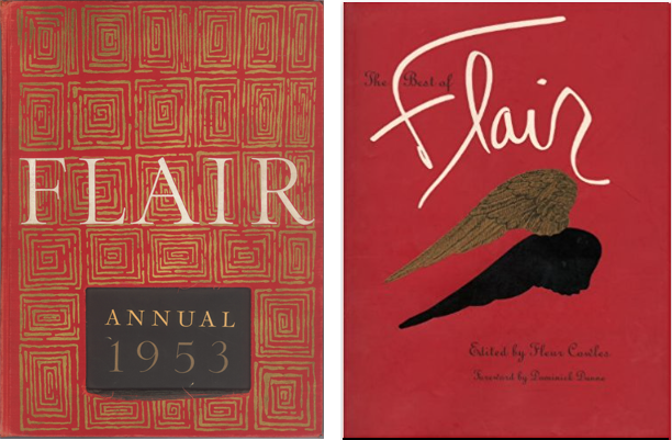
Flair Magazine 1953 Annual

Left is the original 1953 Annual, and right is a reprinted compilation of the critically acclaimed magazine.

While out and about last weekend I happened to wander into a Barnes & Noble bookstore.

As usual, I found myself in the Graphic Design section, and my attention was immediately drawn to a large red volume on the top shelf.

Pre-ecommerce, I had searched unsuccessfully for another copy, wondering if the magazine had been published for more than just one year. The volume in B&N was confined in a clothbound box and shrink-wrapped, so there was no opportunity to browse its pages.

Knowing Flair was again available, I checked it out on Amazon. Still, no opportunity to flip through the pages but with plenty of copies available, I snatched up a cheap one just so I could cut out the uniquely designed and printed pages.

Flair was quite innovative and was said to be “the first magazine that became an art form,” featuring the work of Salvador Dali, Matisse, George Bernard Shaw and Walker Evans to name just a few.

According to the Amazon description of the new publication, “this facsimile edition offers the same ingenious bookmaking of its predecessor, including multiple gatefolds with die-cuts, booklets, and accordion folder leaflets.”

If you’re a fan of uniquely printed art, you might pick up a copy of the Flair Annual 1953 while it’s still available.

Following the Dream on Throwback Thursday

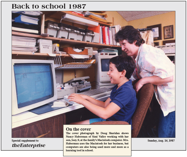
back-to-school

Very few people understood what we Mac Fanatics were up to in 1987 (let alone 1985), but I was following my dream of designing and printing from the desktop. The following month I made the business official and called myself Desktop Design. Today is little Joey’s 36th birthday. He currently works for Disney Studios as a Global Analyst. Happy Birthday, Joey!

Featured Artist – Julia Sutliff, Spring/Summer 2013

Julia Sutliff

Julia Sutliff creates oil paintings of nature near her home north of Baltimore, Maryland. She prefers to paint outside, “en plein air,” and in one session. This mode of working, she feels, gives her the courage and energy to take risks in her painting, and it enables her to capture color, composition, and depth perception as she experiences them. Also, the thrill of being in nature lifts her spirits, and since her paintings tend to mirror her mood, it helps to go where her mood is best. The natural world, she says (somewhat ruefully, for interior work would be more comfortable in winter), contains the only imagery that moves her to paint.

She is appreciated by collectors and fellow artists for her sense of color and her “flair for simplifying form and color in order to capture the essence of a scene.”

One notes that, “the energy in her brushstrokes takes me beyond Impressionism. It’s like Nature itself. Alive. So full of movement, always changing and evolving.”

Sutliff has been noticed for having “an eye for the underlying beauty of landscapes that most of us would overlook” and painting “places that are unspectacular, often in areas where development encroaches on nature.”

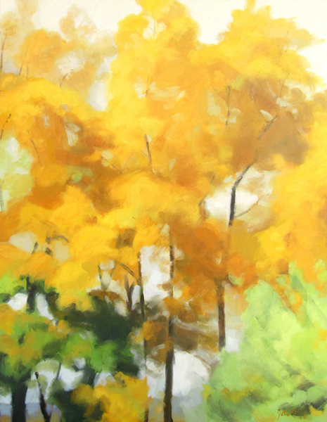
Gold Trees, 36"x28", oil on board

Gold Trees, 36″x28″, oil on board

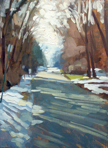
Long Shadows, 16"x12", oil on board

Long Shadows, 16″x12″, oil on board

When viewing one of her paintings, says a collector,  “I feel I’m reaching into the heart of that scene and feeling its pulse, its heartbeat.”

Julia Sutliff received degrees in literature and teaching from Brown, the University of Maryland, and the College of Notre Dame of Maryland. She has taken classes in painting at the Rhode Island School of Design and the Maryland Institute College of Art.

Sutliff has shown her work often in Maryland and nearby states including Pennsylvania, New Jersey, Delaware, and North Carolina.

To see more of Julia Sutliff’s work visit JuliaSutliff.com.

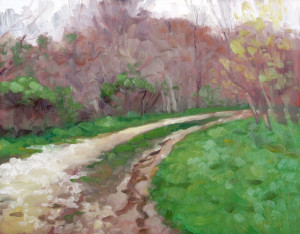
Rainy Path, oil on board

Rainy Path, oil on board

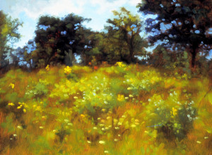
Carnival Hillside, oil on board

Carnival Hillside, oil on board

Architecture and Graphic Design Play Off One Another

Montreal Condos

Condos on a small island strip in the middle of the St. Lawrence River.

Each time I travel I make new discoveries, and often, insights and inspiration comes only once I’m back home and have had a chance to unwind and process the whirlwind adventures.

On this trip which began on the St. Lawrence River in Montreal, Canada, I became particularly focused on the art and design in architecture (probably because there wasn’t much wildlife or sport activities in our itinerary). I found the range in age and architectural styles to be visually stimulating without appearing to end up in a hodge-podge of visual clutter. Continue reading

I’m a Photo Horder

unedited octopus

I was pretty sure that among the 200-some-odd photos I had taken, there had to be an octopus somewhere.


octopus, starfish

By opening up the shadow areas and toning down the highlights in iPhoto, the values are redistributed to more closely resemble the actual scene. However notice the reflection in the lower left quadrant of the screen.

In the small dark cavern, I would have completely missed the fact that the octopus was there at all had I not made the quick adjustments that open up the shadow details. I performed the adjusted preview in iPhoto on my Macintosh, but Microsoft’s comparable software is Windows Photo Gallery.

I learned lots of valuable lessons in photojournalism classes, many long forgotten, but a couple of lessons really stuck. Thirty years ago when, as students, we were advised to Shoot a lot, our biggest complaint was the cost of film.  Today, the cost of digital equipment pales when compared to film and processing costs, so I was surprised to learn that one of my companions on a day-long adventure to the Aquarium of the Pacific was throwing away photos after she previewed them on her iPhone, deciding they didn’t “turn out.” I wondered how it was possible to make such a quick decision about the images under such poor conditions and on such a small screen.

The next day, I showed my companion a rough edit slide show of my 230 images. I put them up on the big screen tv. She, on the other hand, had only 13 images, which we viewed on her iPhone. Granted she’s not a fanatic like me, and didn’t shoot as much as I did, but I can’t help by thinking about the photos she threw away. “What if there were details in the image that she missed on the small preview screen?” I wondered. “What if she could adjust her lighting after the fact?”

The reflection in the previous images has been replaced using the “content-aware” feature in Photoshop.

My first task after downloading photos to the computer is to make preliminary adjustments to the tonal values in the images. It’s a relatively “quick” and painless process, and I finished this batch in about 2 hours, or about 30 seconds per image. Unless you are serious about photography, you might unwittingly skip this most critical step, so that’s where the hording comes in to play. Don’t throw away any photos before you perform a quick adjustment to the image’s tonal values.

In the edited photo, the reflection in the lower left is more obvious than before, so I bring my photos into Adobe Photoshop where I make all the actual refinements and adjustments. To eliminate the glare, I made a feathered rectangular selection and filled the area using the “content-aware”  feature, which gathers data from nearby pixels to simulate the surroundings.