Category Archives: Color
Not Another Green Marble Background?
For a designer, creating a new look for a green marble background is like bringing out the old bell-bottoms and believing they look as cool as they did in 1969.
Filling a “simple” request can be not-so-simple if you make a lot of blind starts, like spending an hour hunting down an old CD filled with stock marble images, just to find they are in an outdated graphic format.
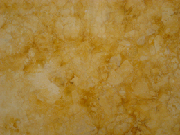
A second blind start—searching stock images—another hour easily wasted as I realized, why not create an original image? Not only can it be easy, but the price is right. We refurbished our kitchen a few years back, and while out searching for the right granite counter top, I took plenty of photographs of the various granite and marbles, but none were green. Take them into Photoshop, and with a couple of well placed clicks I was able to turn my images into perfectly suitable green marble backgrounds.

By applying levels to increase the image’s contrast, and then applying a hue and saturation effect, the result is this rich, green marble-like background.
There are only two steps to go from the original photograph of the gold marble to the green. First, I created an adjustment layer for “levels” to increase the image contrast. The adjustment layers are forgiving in that they allow you to manipulate the data at any time without destroying any of the original pixel information.
The second step is to create and adjustment layer for “hue and saturation.” There are three areas that can be changed within the H&S palette, but before changing anything, click on the “colorize” button. This extracts all the color from the image, assigning a default hue to all the pixels, while maintaining their original values. Next, the hue slider cycles through the “rainbow” — ROY G. BIV (red, orange, yellow, green, blue, indigo, violet) — stop at the desired green hue. The saturation slider adds or subtracts color, and finally the bottom slider lightens or darkens the values.
Of course, to achieve the desired result might require additional steps, depending on the nature of the original image. You might want to add additional layers of color, transparency, contrast, and texture to create a unique effect.
If you want to create a library of backgrounds and textures, do it yourself. Textures exist everywhere, and for every photograph you take, you can manipulate it in an infinite number of ways.
With today’s image editing programs, you don’t have to mortgage your home or rent out your kids to afford amazing software. I’m currently experimenting with an app called Pixelmator, a $15 Photoshop wannabe, and after half an hour of playing (and they call it work), I can say it’s certainly worth the investment. In fact, I’d recommend Pixelmator to any of my beginning design students who have a newer Mac, but can’t afford Photoshop. This app works on my iMac, now that I’ve upgraded to Lion, but Pixelmator will work with OS10.6 or later. With a little coaxing, I could be persuaded to show and tell more about this cool app, Pixelmator.
Have a Safe and Sane Holiday
Pantone Guide to Communicating with Color
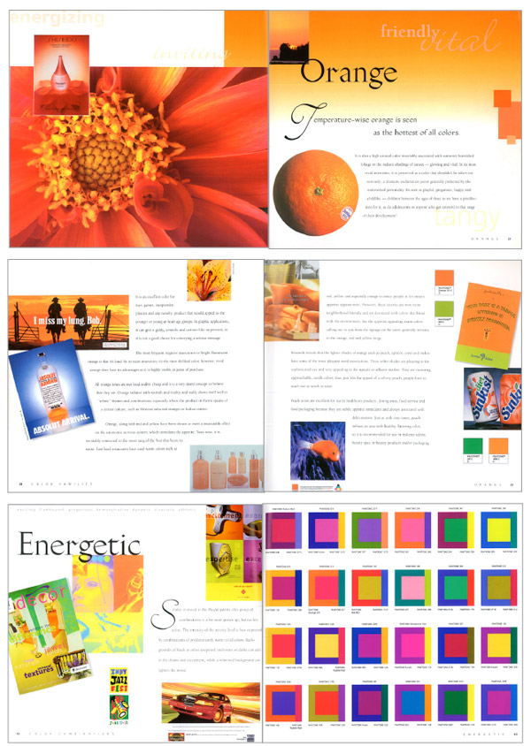 Just a few years ago, Leatrice Eiseman’s classic Pantone Guide to Communicating with Color, published in 2000, was out of print. In 2006 Eiseman came out with a second book continuing her color explorations, Color: Messages and Meanings. By that time, used copies of the first color book were going for nearly $200, way too steep for all but the collector.
I recently saw Eiseman’s 2000 book pop up again on Print and How magazines’ mydesignshop.com website in their “Deal of the Century” category. While it’s a bit too soon to make a hundred-year claim, I have to admit, Print and How magazines are offering those interested in the study of color a truly smoking deal.
Treat yourself and your designer buddies to a priceless holiday gift that you can be sure will be a handy resource for years to come. I’m delighted that I’m able to replace my tattered copy held together by rubber bands with a brand spanking new book for just $4.99. That’s really has got to be the “deal of the century!”

