Category Archives: Card Making

Consider Envelopes and Packaging Before Determining Card Size

We understand that when inspiration strikes, you want to start work immediately on creating your greeting cards. However, it is important to consider the size and style of the envelope and packaging before choosing the size for your card. Once the envelope size and style are chosen, create  the greeting card slightly smaller so that it will slide easily into your envelope.

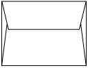
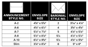
It’s best to begin with the envelope style and size. Envelope styles are generally defined by their use; for example, commercial, booklet, ticket envelopes and so on. For artists and crafters creating greeting cards, one of two envelope styles are typically used—baronial and announcement envelopes, which differ in their size and the shape of the envelope flaps.

baronial style envelope

Baronial Style Envelope

Baronial envelopes are considered the most formal of envelope styles and have a deep, pointed flap. While they can be used for greeting cards, they are most widely used for formal invitations and announcements.

announcement style envelope

Announcement Style Envelope

Announcement envelopes are made to be used with a much wider range of text weight and cover papers than baronials and are distinguished by their shorter, squared flap, which can be plain or deckle-edged.

At Oak Creek Printworks, we carry mainly the announcement style envelopes because they are available in a wide range of paper colors and weights; whereas, with baronials, there is typically less choice.

Recently we were able to create a unique blank note card set with with matching baronial envelopes and we wanted to let you know about this new product.  We have created a limited quantity of matching cards and envelopes in bright yellow, hot pink, purple, lime green, and bright orange. A6 size bright note cards and matching baronial envelopes are an Oak Creek Printworks original!

envelope size chart

A6-bright-set

A6 size note cards with baronial style envelope

Giving Holiday Greeting Cards Still a Cherished Tradition

Dayton Daily News
The holiday greeting card is just as important in 2011 as it has been in more financially robust times, according to area designers and retailers. After all, as Joe Bohardt of the Mulberry Tree in Oakwood points out, a beautiful holiday card is a gift … MORE

Young Wellesley entrepreneurs to sell greeting cards

While some store fronts stand empty in town center, a new cottage industry has sprung up in Wellesley this fall, and it’s run by sixth-grade social entrepreneurs.   Their product is recyclable greeting cards, and their manufacturing center is a couple of classrooms in Wellesley Middle School that constitute “House R.” Read more:


Fall Fashion Tassel Set for Bookmarks and Sleeves

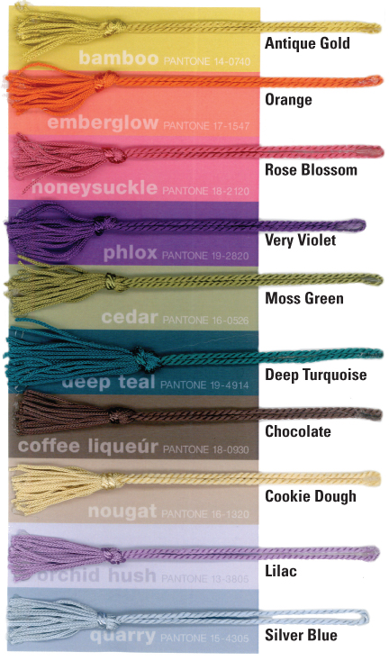
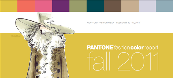
4-inch chainette tassels, fall colorsThese 4-inch chainette tassels will dress up your bookmarks in the latest in fall colors. The Pantone fashion color report for Fall 2011 highlights top fashion designers’ color picks and is a great resource for anyone who wants to keep up with current color trends.

Here’s how our bookmark tassel color selections compare with the Pantone picks. Bamboo-Antique Gold, Emberglow-Orange, Honeysuckle-Rose Blossom, Phlox-Very Violet, Cedar-Moss Green, Deep Teal-Deep Turquoise, Coffee Liqueur-Chocolate, Nougat-Cookie Dough, Orchid Hush-Lilac, Quarry-Silver Blue. Pantone’s fall 2011 designer colors are just a few of the over 40 tassle colors available in the Oak Creek Printworks store.

You may discover other uses for these multi-colored tassels. Glue them to greeting cards to add dimension to your designs using tassels to represent a myriad of items, from inanimate objects like trees and broomsticks to creatures large and small. Combine with pen and ink of other media to create unique composition. Attach tassels to small baronial cards, gift cards or gift packages to give them an added touch of elegance.

Click here to add a Fall 2011 tassel set to your shopping cart.

Add Natural Texture of Mulberry Paper to an Image

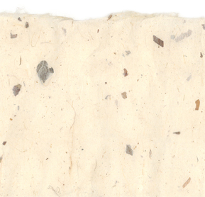
High resolution photos are hard to find without purchasing. If you are looking for photos to use as backgrounds in your artwork, look no further. To download this week’s image, click on it. When the high resolution copy appears, right click on it to copy or save it.

The 11×17-inch scanned image of mulberry paper can be used as a background in graphic design or photo illustration, crafts or greeting cards, and gives the appearance of natural texture. Any time you are printing and desire a paper color and texture other than white, consider scanning a natural, handmade paper, where each sheet is unique.

mulberry paper thumbnail

Terms of Use: You can use this image for anything you wish (e.g. advertising, printed materials, product packaging, presentations, brochures, greeting cards, postcards, book covers, etc.) as long as you do not copyright it or resell it. Oak Creek Printworks and Oak Creek Marketplace, Inc. are not liable for any damages incurred by your use of the image. ©2011 Oak Creek Printworks

Featured Artist Pays for Mission Trip by Making and Selling Greeting Cards

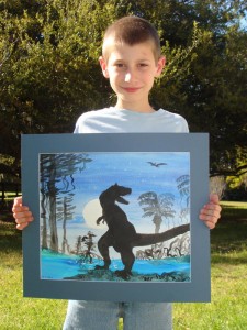
Graydon McKoy holds "t-rex"Graydon McKoy is a nine-year-old boy finishing third grade, and is in his first year of home schooling. He lives with his parents on Wadmalaw Island in South Carolina, a very rural ­island with a farm rich history located in ­Charleston County. Graydon’s father, one of the few farmers left on the island, grew up ­farming with his father. Graydon’s mother has an advanced degree in biology but is now using her knowledge to home school the ­budding artist. With the background both of his parents have to offer, it is no surprise that Graydon loves the outdoors and every creature that inhabits it.

Since he was very little Graydon has loved books about nature and enjoyed taking walks to observe God’s creatures, no matter where, or how slimy they were.

In addition to searching for wildlife, ­Graydon cares for three horses, one German ­Shepherd and a cat, but what he really wants is a snake. His mother has not yet consented to that request, but they have spent the last three summers documenting the snakes they find on their farm. To date they have spotted over 13 species of snakes and look forward to ­participating in the annual springtime snake round-up that the local serpentarium conducts.

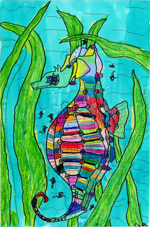
seahorse

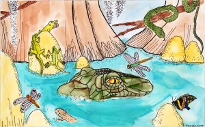
Graydon’s art began at the young age of four, and highlighted the favorites of all little boys: sharks, alligators, dinosaurs and snakes. Thanks to a great art teacher from first grade, his talent was cultivated and his horizons expanded with the love for animals remaining as the main theme in all of his work.

In a span of just three years, ­Graydon has developed quite a portfolio, which his mother has saved, and scanned onto computer discs. His talent was put to use this year when Graydon’s family decided to go on a mission trip with their church to Costa Rica. They did not have all of the ­funding needed to pay their way, so his mother had an idea to use Graydon’s art work as a fund raiser.

She took some of his pieces that had been scanned and then put them on her computer and converted them into note cards. The cards sold really well, and not only raised enough money to pay for all of them to go to Costa Rica, but, also raised enough to pay for a home school trip afterwards.

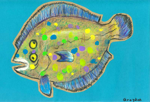
As a result of this success, ­Graydon now has his very own business and calls it “Graydon’s Critters”. He is working on two new series; one focusing on Charleston and one highlighting the fish served at a local seafood restaurant. He ­continues to practice with mediums such as chalk, watercolors and oil pastels, but is expanding to acrylics and looks forward to learning how to mat his own work.

To see Graydon’s portfolio, visit his website – www.graydonscritters.com. You’ll also find Graydon’s Critters on Facebook.

marsh flounder

Could you be the next Featured Artist?

As we are about to transition to our next Featured Artist, we want to let you know that…Oak Creek Printworks is always searching for future Featured Artists!

At Oak Creek Printworks we assist artists in promoting and marketing themselves by providing packaging and displays for greeting cards, as well as presentation products for a range of artistic formats.

Featured Artists are chosen quarterly, and their work is presented on the cover and in the center spread of our catalog. The Featured Artist’s work is also displayed in our website banner, and in a blog article, where they have the opportunity to talk about their featured artwork. We link to the artist’s website to drive traffic there, and award each Featured Artist a $100 credit in products and services (including printing services).

In choosing each Featured Artist, we look for an artist whose images are strong enough to stand alone, while also working in sets, demonstrating their ability to focus on a theme that can then translate to a set of greeting cards. We review digital portfolios on an ongoing basis. There is no application to complete—just put “Featured Artist” in the subject line of an email, and let us know that you would like to be considered. Include all of your contact information, as well as your artist biography and any articles and images you’d like to see published in our catalog. If you have a website, we can review your work online, otherwise you can send us jpegs or pdf files to review. We do not return any material we receive by mail.

If you are chosen, you will be asked to sign a digital release allowing us to reproduce your images and written statements in digital and print format. We will also ask you for your artist’s statement, a biography, one or two photos of yourself, and at least 12 images of your work (ideally in 3 sets of 4). All images should be in jpeg format, 300 dpi (at least 10 megabytes each).

Check out our previous featured artists:

Niamh Slack
Elizabeth Vanduine
David Southern
Klaus Lange
Angela Sharkey
Georgia Lange

Fashion colors of 2011 highlighted

pantone fashion color report

“Designers take a painterly approach to fall 2011 by artfully combining bright colors with staple neutrals, reminiscent of how an artist would construct a stunning work of art,” said Leatrice Eiseman, executive director of the Pantone Color Institute. “Much like a painter’s masterpiece, there is a certain romance to this season’s palette.”

And because designing on paper and designing for fashion are so closely related, it’s worth taking a look at the fashion world’s color selection for 2011.

Flowers, Color, Form Background for Business Card

Graphic designers have lots of problems. With every job we accept we’re presented with problems that are begging for solutions. Recently I was presented with a problem…a purple and green flower for a business card for a massage therapist in the middle of winter…in Southern California. No sweat.

lily of the nile

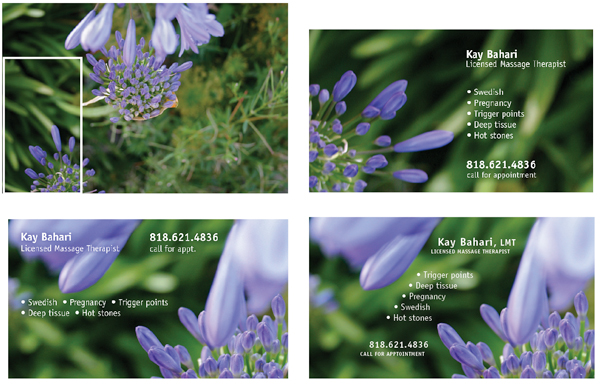
This is the full frame of the image that became the foundation for the business card.

When I took a series of digital photos on the macro setting, I was thinking about colors (purple and green) and holding still enough to focus the camera on a target that was swaying in the breeze. I wasn’t worrying about composition. Just keep the flowers in the frame before the wind catches them.

I had no idea if these Lily of the Nile would have any chance of working on a business card. I had taken the photos weeks before, and when it came time to buckle down and create the image that would carry the business card, I found my answer by looking at the flowers, not as a whole, but for their “parts.” Perhaps there is just a small part of the image that contains the necessary elements to play a supporting role to the typography?

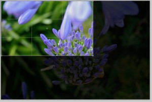
In order to isolate just the right section of the image, I worked in Adobe Photoshop, but most image editing software has a cropping tool or a selection tool with the ability to crop to a selection. In Photoshop, I fixed the width, height and resolution of the cropping tool to 3.75 inches by 2.25 inches, 300 pixels per inch, adding one eighth of an inch to all four sides to allow for a bleed. When fixing a cropping area, the size of the area can change, but the correct proportions remain constant.

Photoshop's cropping tool can isolate a precise area, resize and resample the pixels to the desired resolution in a single step.

Once a specific area of the image is isolated and cropped, that segment of the photo now stands alone at the correct size and resolution to become a unique background for the business card. The same image could just as easily be cropped and sized for greeting cards, postcards or bookmarks.

Typography is always a challenge. When white type is reversed out of a background, in this case, a moderately busy background, it begins to get lost. It’s almost gobbled up by the very background that’s intended to support the type.

To prevent the white type from becoming too difficult to read as it moves over alternating light and dark leaves or purple petals, a dark green is sampled from the background and used to give it an “outer glow” effect. If reverse type is placed over a purple petal, sample a slightly darker purple for the outer glow to allow it to “pop” off the background.

type before outer glow

type after outer glow is applied

Because we designers are never satisfied with just one version of our layout, I used two different photos with a variety of type alignments before sharing them with the client.


Guide to Greeting Card Sizing

Preparing handmade greeting cards or note cards can be tricky, especially if you want them to fit in standard sized envelopes. Here is a chart that will help you as you prepare your card stock and artwork. Protective sleeves are also a nice packaging touch, and can be purchased to fit only one card and envelope, or up to 8 cards and envelopes. Note that the A6-8 sleeve only holds about four A6 greeting cards and envelopes.

Use the charts below indicated standard U.S. sizes to assist in sizing when creating your own greeting cards.

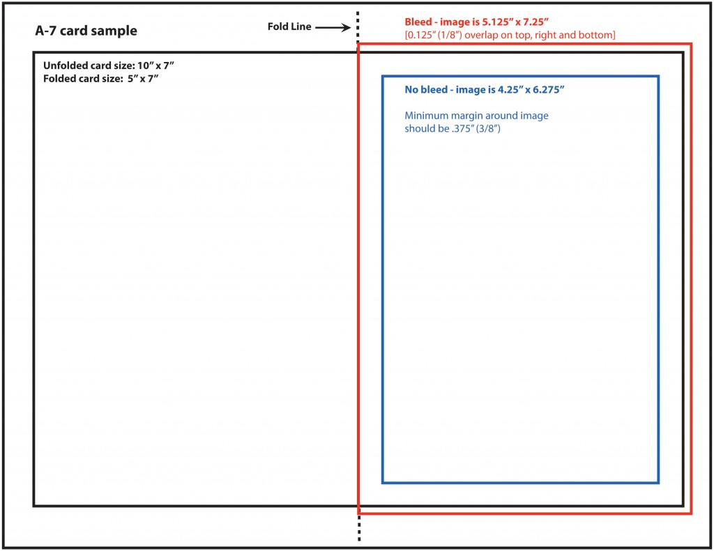
The sample below shows how to position your artwork on 8 1/2″ x 11″ cardstock. If you are using electronic files, and you want the image to print right to the edge of the card (called a “bleed”), the image needs to be larger than the size of the card. The red lines below indicate the bleed position on an A7 vertical card. The bleed must hang over on three sides by a minimum of .125″.  Then, after you print your card you can trim it to the right size.