Category Archives: Card Making

Cardmaking: Creating depth with cutouts

by Nancy Haberman

Recently I assisted a colleague who was learning the finer points of Adobe Illustrator’s pen tool. Our goal was to create images that would adorn products related to the sea. The resulting artwork of a seahorse was intricate and stunning, and a discussion followed about using it on a greeting card.

Commercial greeting card publishers have forever pushed the envelope when it comes to greeting card presentation techniques, relying heavily on high end print and print finishing processes. While holographic and lenticular printing are too pricey for the average working artist and crafter, other finishes like die cutting, embossing and engraving are now within reach of those willing to invest in new desktop equipment and take the time to learn how to use it.

The desktop publishing revolution turned artists and crafters into self-publishers. Fast forward 25 years later, and a trip to Border’s, Target or any greeting card store reveals that it takes more to excite the eye of a card buyer in 2010 than cheap two-dimensional Photoshop effects, long ago passé. Continue reading

Photo Contestants Beware: Read Contest Guidelines Carefully

by Nancy Haberman

Some time last spring, knowing that I was fond of hiking and photographing in the hills of Simi, a friend suggested I enter some of my images in a postcard contest sponsored by the local Chamber of Commerce. I’m not usually lured by contests, but due to the particular subject matter of this contest, I have to admit, I was intrigued.

I’d always wanted to make postcards from my “Simi Rocks” images, a series of landscape note cards I created between 2000-2004, so I immediately I began a rough edit of my archived photos. Many of the note cards depict the Simi and the adjacent Conejo hillsides, which are dotted with gnarled and mangled oaks. The environment became inspiration for Oak Creek Printworks. The hiking trails that surround our little valley run through a rocky landscape that was home to the Chumash Indians, and later to early western film stars and crews. The few areas that remain open space tell tales of movie land cowboys and real life Indians. I swear there are commercials running on television Continue reading

Greeting Cards Reign Supreme in 21st Century

by Nancy Haberman

"Sunrise" by Jennifer Simpson

If you are reading this post, you are living in a world driven by technology. Paradoxically, there has been a trend in art and graphic design towards “things handmade,” or anti-technology. Where once a graphic designer strove to make designs and typography more perfect and mechanical, new designers rebelled by distressing type and creating designs that appeared constructed and hand crafted. If you are a reader of any of the Stampington publications, particularly Stamper’s Sampler and Take Ten, you’ll find examples of some of the finest rubber stamped and hand crafted greeting cards that I’ve seen by crafters in the western hemisphere. Complex designs using mixed media have found a home in the greeting card, even if they do use basic elements created by others.

Twenty-first century creative individuals have growing access to Continue reading

School fundraisers feature student artwork

OLMCS - Student art cards for sale in 2010 fundraiser

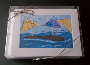
Our clients have great ideas. The mom’s at Our Lady of Malibu Catholic School decided to sell the children’s artwork as card sets for this year’s fundraiser. They printed up the cards, but were not sure how to package them. Following a little internet research, one of the moms visited us, wanting to see our clear plastic boxes. After trying a few different sizes to fit both the envelopes and cards in the same package, the result was a professional product for sale, worthy of any store or boutique. And economic too! In addition, the clear packaging allowed them to print a page to insert in the bottom of the box, profiling the artist and showing the prints enclosed.

Congratulations to all the budding artists at OLMCS, who now have the distinction of having sold their artwork. They are off to a great start.

Past clients include public and private schools, and Sister Cities International, which features artwork from children around the world. Take a look at some of their artwork. Perhaps it will inspire you. To check out packaging options, see recent blog article “Greeting card sets – a great marketing idea!” by David Heyman.

"Great Harvest" - ©2008, Sister Cities

"Quilt" - Weathersfield School

"Lions" - Montgomery High School

Crisp creases for handmade greeting cards

By David Heyman

Producing handmade greeting cards is a creative endeavor, whether you make original art on the cards, mount photographs on the front, or run blank cards through your inkjet printer for digital techniques. Whatever method you use, at the end of creating your masterpieces, you end up with needing to fold the cards to produce a finished product.

Here are two tips to help you acheive stress-free and professional results:

What is a Protective Closure Sleeve?

By David Heyman

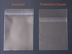
Crystal clear sleeves have an adhesive strip to seal the bags against dust, dirt, bugs and fingerprints, keeping your greeting cards and photographs in pristine condition. This adhesive strip is the key difference in a protective closure style sleeve.

Standard and protective closure sleeves

With standard sleeves, this adhesive layer is on the back of the flap. Simply pull off the cellophane liner, fold the flap over and the bag automatically seals. This works well for most uses, as the sleeve is protecting your contents, while allowing for removal of the item if necessary. Your cards or photos can be changed out, as the sleeves can be re-sealed several times. Continue reading

Scanography: Camera-less photography!

by Georgia Lange and Stephanie Ferguson

Are you technologically challenged? Does your busy life leave no time for that photography or painting class you’ve always wanted to take? If you are still yearning for a creative outlet, scanography may be for you. With both fine-art and commercial applications, this is a marvelous tool that just about anyone can use and have fun with. If you have access to a flatbed scanner, you can create beautiful images that Continue reading

Greeting Cards: Simple, Fun, Classy and Budget Conscious

by Kimberly Foster

In today’s economy, every penny counts.  Making classy, creative, expensive-looking greeting cards, invitations, place cards, bookmarks, and envelopes to match, will fit into any budget.   All you really need are 3 things to get started, and chances are good that you already have them: paper, glue and scissors.

You can actually create your own cards and envelopes with any type of paper you choose, but if you just want to dive right into decoration, you may want to start out with ready made blank cards and envelopes. Blank cards are a perfect way to get started making professional looking cards even if you are just beginning.  They truly leave you little room for error!

So, once you’ve either purchased or made your blank cards, it’s time for the really fun part. Continue reading

Papercut design leads to Louie Award winning cards

by Nancy Haberman

My fascination with paper cutting and paper crafting began in the 70s at an exhibition of Jewish folkart at the Skirball Museum in Los Angeles. To be honest it probably began in kindergarten when I was given a pair of scissors and colored construction paper, but then that would be a different post.

I suppose an attraction to the graphic nature of paper cuts is not uncommon given that many religious and cultural traditions have used paper cutting in their folk art and marriage documents for centuries. I saw a lot of this kind of art on the walls of friends and family – they are part of my earliest memories.

Continue reading

10 Easy tips on displaying your greeting cards

OK, you’ve decided that one way to sell your artwork is on greeting cards. You’ve found some places to sell them – craft fairs, farmer’s markets, local merchants. However, displaying them in booths or on the countertop is different than displaying larger artwork. The most common ways to display cards are in spinner racks, on slat walls, on acrylic shelves, and in free-standing displays. Any display that shows the full faces of cards is ideal. Beyond that, greeting cards aren’t exactly a three-dimensional product, sometimes making them difficult to display creatively.

Here are some easy tips on how to display your cards for sale.

1. No room for a table top display at your farmer’s market booth? Show them off on string or colorful ribbon strung between the posts of your booth or hanging vertically. You can even find mini-clothespins at a craft store to attach them. Keep cards for purchase stored in a box under the table.

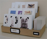
2. Make shoe boxes (perhaps wrapped in wrapping paper) with dividers for clients to sort through. Just Something I Made is a wonderful blog on how to build a tiered box system for displaying your cards.
JustSomething

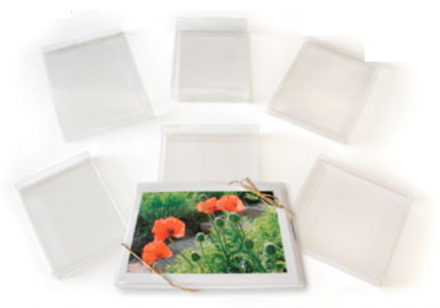
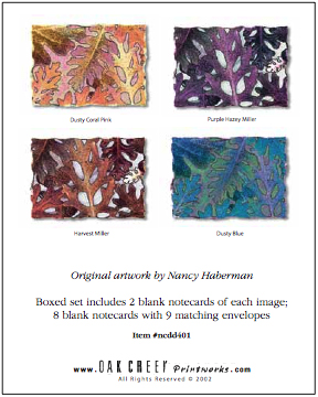
3. Sell sets in clear boxes. Prepare a sheet for the bottom of the box that shows all the card designs included in the box, as shown below:
ClearBox ClearBoxInsert

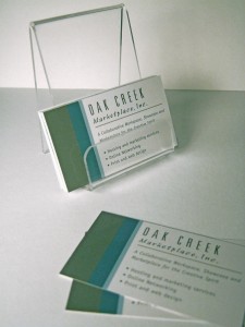
4. Buy acrylic cardholders for counter-top display. These can be very inexpensive, and are perfect for displaying just one or two card styles on a countertop. Oak Creek Printworks carries small and large stands.
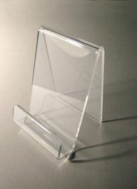
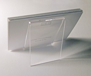
AcrylicEaselSm BackEasel BCEasel

5. Use office divider racks to display your cards. Some office supply stores have what they call “junior” racks, which are smaller than the 8.5 x 11 file size racks (too big for greeting cards).
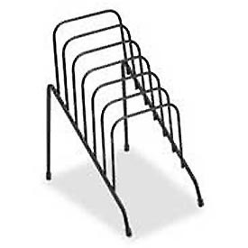
WireRack

6. Laminate your cards together on a large sheet of paper. If the cards are blank inside you can just show the fronts. If there are verses inside you will want to show both the front of the card and the inside.  These laminated “posters” can be displayed on a table or by hanging on a wall.  Depending on the size, they can also be displayed in an album or flip chart. The art always stays clean, and you can even use dry-erase markers to write on the poster, and wipe it off later. Perfect for listing prices or emphasizing sale items. The actual cards for purchase can be stored in a box or file under the table.

7. Display your art online using a website or a blog, such as Facebook or WordPress.

Facebook – Display your designs and cards on your own facebook page. Link to your blog on WordPress. Join groups of artists who will link to your page and blog, like the Graphic Artists page.

WordPress provides public domain blogging software, which means it is FREE! It is easy to set up an account. Here are some examples of sites that are selling cards with WordPress sites:

Rikki O’Neil and Friendship cards

8. Use a scrapbook or portfolio book to display the cards on a counter top, and store actual cards for purchase in a box or file underneath the counter. The scrapbook can be purchased or even homemade.
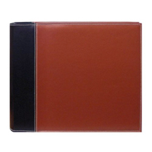
scrapbook
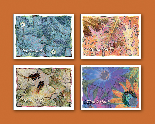
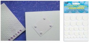
9. Arrange a 3-D display on heavy posterboard using the adhesive 3-D dots that scrapbookers use for their album pages. The downside to this method is that if the display board or cards get dirty or dogeared they can be hard to clean.
PopPoster-Cards dotPoster

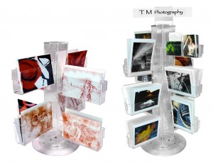
10. Acrylic Spinners – a perfect countertop or floor display.
Blog-spinners

Don’t forget, when displaying your cards, the best way to protect the artwork as potential customers handle them is to use some type of protective sleeve. Check out our card jackets, no-flap bags, and protective closure bags.

We hope that this information has helped you, and would love to hear how you display your products. Leave a comment, or send us an email at info@oakcreekprintworks.com. Include a photo and we will try to post it here on the blog.