by Nancy Haberman
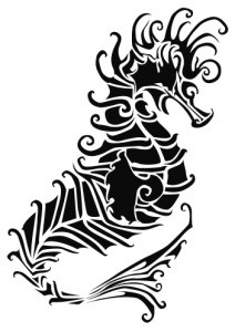
Recently I assisted a colleague who was learning the finer points of Adobe Illustrator’s pen tool. Our goal was to create images that would adorn products related to the sea. The resulting artwork of a seahorse was intricate and stunning, and a discussion followed about using it on a greeting card.
 Commercial greeting card publishers have forever pushed the envelope when it comes to greeting card presentation techniques, relying heavily on high end print and print finishing processes. While holographic and lenticular printing are too pricey for the average working artist and crafter, other finishes like die cutting, embossing and engraving are now within reach of those willing to invest in new desktop equipment and take the time to learn how to use it.
The desktop publishing revolution turned artists and crafters into self-publishers. Fast forward 25 years later, and a trip to Border’s, Target or any greeting card store reveals that it takes more to excite the eye of a card buyer in 2010 than cheap two-dimensional Photoshop effects, long ago passé.
 While the seahorse illustration is dynamic presented in black and white, when presented solo on a 5”x7”, A7 greeting card, the image seemed as if something was missing. Such an elegant seahorse deserved more than some lowly computer effect like bevel, emboss, or drop shadow. While fine for newspaper ads, the seahorse greeting card deserved better treatment.
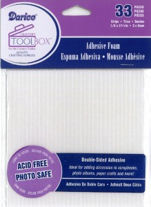
We used an Astrobrite® 80lb. Eclipse Black cover stock for the base card. The cream colored seahorse formed by the negative space in the die cut, is made with a pearlescent 80lb. cover stock called Aspire Petallics® The color is called Beargrass. To create a five millimeter standoff accenting a natural shadow, we use adhesive foam that comes pre-cut on sheets in several shapes and sizes.
 Learn more about each of the items included in the Seahorse Greeting Card by following their corresponding links, or check out the card-making page where you can more closely examine the elements necessary to make a cutout greeting card of your own.
Cutouts and cut cards are a long tradition in many religions and cultures. Artists like Risa Mandelberg of the Paper Doll Company carry on the tradition today. Artists and crafters beginning their own adventures in card making or papercutting should probably begin with simple images until they have basic command of tools and materials:
Tools – scissors, cutting knife, punch, die cutter
Materials – Paper, card stock, or appropriate material for respective tool, adhesive (spray, stick-on, etc.)
Cutting techniques are different, depending on the tools one uses. Either a complex or simple monochrome illustration is a good candidate for a paper cut card. The textural quality and color of the materials make the physical card both a visual and tactile experience with a real, live physical drop shadow that changes relative to the viewing light source.
Die cuts, cutouts and appliqués provide artists the opportunity to explore a variety of papers, adding color and textures to the design in a way that no other process can. As an artist, I find the most attractive feature in the new crop of consumer die cutting machines like the one used for the seahorse is that they do not restrict artists to stock clip art loaded onto expensive proprietary cassettes, like many of the lower cost die cutters. A very sharp Xacto knife and lots of cutting skill and patience can produce similar results, but a desktop die cutter takes the drudgery out the cutting process and simplifies its repeatability. Paper punches for rounding corners or cutting out pre-determined shapes are available on the scrapbook aisle of most variety and craft stores.
